WWII Army Air Force Markings
Posted July 2010
All right, you're going to
ask: "What does this have to do with Fly Babies?"
This article stemmed from a
discussion on the Fly Baby mailing list. A comment was
made about
the historical accuracy of the "Junkers" cosmetic reworking by
two British and one Texan Fly Baby owners. I
allowed
that the paint schemes might not be strictly historically
correct, but
that bothered me less than the mistakes people made when they
tried to
put US WWII markings on their aircraft...including both ACTUAL
wartime
planes, as well as the Fly Babies so marked. And the
question
then arose, "What mistakes do you mean?" And this article
resulted.
There is actually a stronger
Fly
Baby tie-in: one of Pete Bowers first articles for the
FLYER
magazine in the '70s was about WWII markings for the US Army Air
Force...and how warbirders were getting them wrong. This
article
is strongly based on Pete's original article, with my own
drawings
added to illustrate the evolution of the insignia. In any
case,
pre- and during WWII markings are pretty popular on Fly
Babies.
If you decide to do it...here's how to do it right.
On 11/16/2010 8:10 AM, Ron
Wanttaja wrote:
> The trouble is, *I'm* kinda of that bent. I dislike it
when
people get
> stuff like this wrong. There's a major aviation museum
with
a huge WWII
> section, and looking over it all is an improper US aircraft
insignia.
> It bugs the hell out of me.
OK: I got asked.
The big thing to remember is that the design wasn't just ginned up
from
scratch. It *evolved*, and if you understand the evolution,
you'll understand why it looks the way it does and why errors are so
obvious.
About 40 years ago, Pete Bowers wrote an article for "Flyer"
magazine,
called "Insignia Proportions." This is mostly cribbed from
Pete's
article, so I think we're on topic for the Fly Baby group. :-)
Let me get one other pet peeve out of the way immediately.
There
was no "Army Air Corps" during WWII. The US Army Air Corps had
been renamed the Army Air Forces in mid 1941.
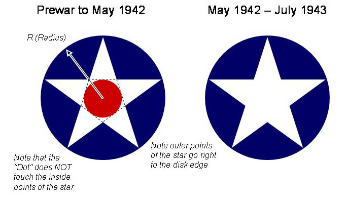
USAAF and US Navy aircraft entered the war with the classic white
star
in the blue disk with the red dot in the middle. People often
get
the size of the red dot wrong... they paint the red dot so big it
fills
the area between the inside white points of the star. The dot
wasn't that big...in fact, if you connected the center points of the
star (generating an inverted pentagram), the red dot would just
touch
the lines. The outer points of the white star went right to
the
edge of the blue disk.
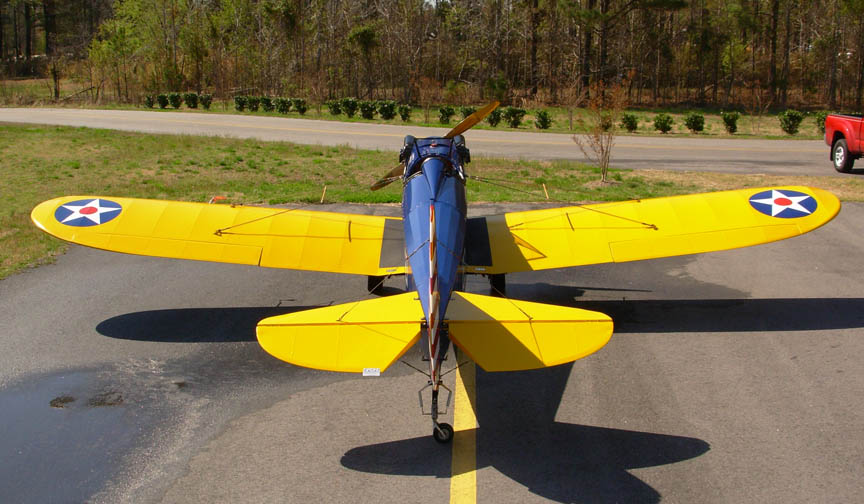
It's a cool insignia, and has graced dozens of Fly Babies.
However, it DOES have a disadvantage during wartime...when the enemy
uses a red dot as their aircraft's national markings. Pilots
would dive on an unknown aircraft and fixate on the red dot, not
noticing the surrounding white star and blue disk.
Accordingly, just a few months after the war started, the AAF and
USN
dropped the red dot. The marking was the same...they just
painted
out the red. (Page 3) Note that RAF/RAAF airplanes
operating in the Pacific did the same. They replaced the inner
red dot of the RAF insignia with a pale blue disk.
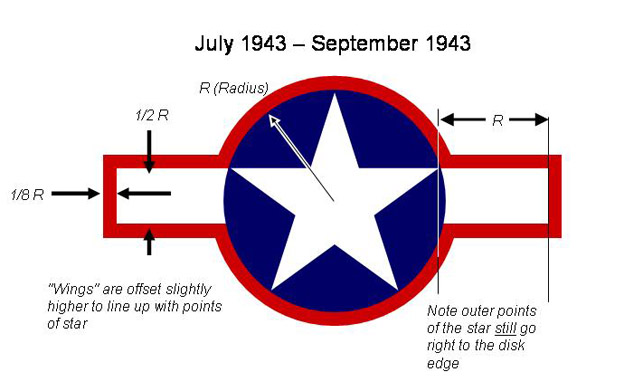
With the red dot gone, pilots started having trouble seeing ANY
markings...with the Olive Drab (or Blue) paint on the top surfaces
of
the airplane, the white star just didn't stand out.
So they decided to add white "wings" to the star. The wings
were
1/2 of the Blue Disk's radius wide, and stuck out past the point of
the
star by a distance equal to the radius.
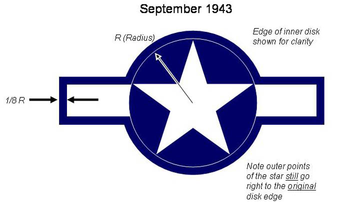
It looked a bit weird sticking out on either side, so they decided
to
add a red border around the entire insignia. This border was
equal to 1/8th of the radius wide, and was added BEYOND the existing
blue circle. Notice how the border turns when it hits the
wings...the original radius of the inner blue disk is apparent at
that
point.
But the powers what be, in their infinite wisdom, decided to make
this
unifying border red. And, of course, the same thing happened
again...pilots got fixated on the red.
So just two months later, the order went out: Paint the red
border the same color as the blue disk.
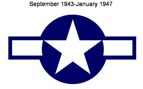
The upshot is that the white star *no longer goes* to the edge of
the
blue disk. That imaginary 1/8th radius border is still
there. This image shows the final result with a thin white
line
around the original disk. Note how the only change is to the
border color:
Here's the same image, with the
faint
border removed (the actual appearance of the markings):
Many US Navy airplanes were ALREADY painted insignia blue...and thus
their national markings just consist of a white star with the white
wings...cutoff as it the blue border was there.
A couple of years later, the Army Air Force became the US Air Force.
Since we weren't at war with Japan anymore, they decided to put the
red
back in. The red bar slightly thicker than the border, being
1/6th of the radius OF THE ORIGINAL DISK.
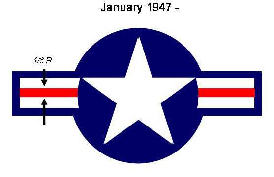
.
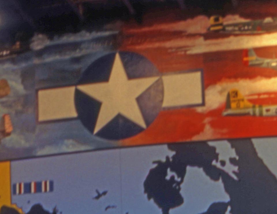
So: With your newfound deep knowledge of WWII USAAF insignia,
what's wrong with this picture?
That's the mural on the wall of the Eagle Hangar at the EAA
Museum. A great piece of art...marred by one lack of attention
to
one subtle detail.
Bet the next time you go to a Fly-In, you'll see at least one $1M
restoration with the markings wrong....
Ron Wanttaja
Comments? Contact Ron Wanttaja
.
 Return
to The Stories Page
Return
to The Stories Page